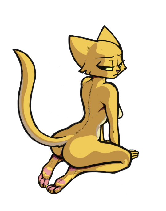
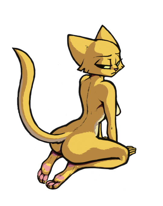
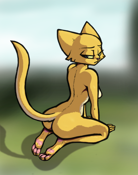
Wears-Only-Ropes – from my story You Only Live 18 Times, which itself is the second in a series I call Spyjirra. If you want to read about Wears-Only-Ropes, here’s the first part of the story:
If you just want to oogle the pretty purple Argonian, here’s a better picture with that huge pesky plot point removed:
Boogeestro did the character design and lines. I did the water background, the sub, and her colors. I’ll be posting a text about the whole thing shortly. I hope you like, because not only is this IMHO the best I’ve ever done, it may be the best I ever will do.
I actually inked this as well as coloring it this time. It was such a cyoot poor Katia, I had to do it. He named it Magical Mishap, but when talking about it to somebody, we started thinking of all the ways we could help put out those little fires on her before they do any real damage. Somehow we decided that if you use your tongue to help soothe the ouchies, she would taste like burnt marshmallows.
And because I always dream up some backstory, I imagine she had just added flame resistant charm to her clothes and was testing it out when FWOOMP! They resisted the flame all right! They retreated from her bodily to escape them in fact.
Original by Damn Lasso Tool. He did his own coloring of it, but I was feeling uninspired and wanted to color something new. So I did some hunting for monochromatic images on e621 and came across this. I’ve never played a Spyro game in my life, but at least I know who Cynder is. Lasso did his own coloring you can see here:
I didn’t see his colored version, or I might not have done this, but I’m glad I did. I think it turned out pretty good. I got to do lots of shinybits and added some
inconspicuous scale texture underneath (if you can see em). I particularly like those little bellylines for some reason. They make me smile.
Lizbians – photo version so hi res is easier. I think.
Here’s another. I’ve posted it already a couple places, but did some final cleanup tonight before putting in places where it’s hard to update. Sorry, another long story I’m afraid. First, about Boogeestro. Sashimi came across him sort of randomly on Picarto and I joined in to watch a stream where he was doing (among other things) what became this Rajirra:
Wow! That’s good!
Couple days later Sashimi asked me what character I’d like to see nekked. (No, Boog doesn’t have a problem leaning risque by any means!) Well, I’m partial to the Argonians in Prequel of course, so I figured Quill-Weave or Weedum-Ja. Then Boogeestro was streaming again and – well I kinda expected it but – he was doing not one, but both! Wow! Cool! Now frankly this is a little more porny than I typically go. Also, this is an altered version of the original sketch already – I’ve lost the true original. But I’ll explain…
There were a couple of things that frankly I didn’t like on the original sketch. Pretty sure Boog wouldn’t mind me altering this one since it was kinda given to me though, so I decided to do some alterations. First, (and you won’t see this cuz I lost the original), Weedum-Ja’s head simply didn’t look at all like her. Mostly her snout was too straight. But it just so happened I have a Kaz drawing I’d colored some time ago of her in profile, so I superimposed it, resizing etc. so it fit with everything else, and then hand-traced it using similar lines styles to what Boog drew originally – primarily the shape of her head. But also, as much I do love the, er… female anatomy, being able to see Weedum’s puddy just doesn’t look right. It’s just not possible given that position. So I altered those lines too. Quill-Weave’s will have to do here.
But also I must mention the linework. I spent a long time working on cleaning up the sketch, and had just about given up being able to make it as clean as I wanted without inking. I started doing that, when Sashimi mentioned something Kaz had suggested called Vector Trace. Sashi thought it was a feature of Photoshop (it’s not – it’s in Illustrator, that I don’t have). But it got me researching, and I found a site where you can upload your sketches and it will turn them into Vectors. I had varying degrees of success with it, having had to clean some stuff up beforehand, so it’s not some miracle for inking, but it’s really cool when it works! So those lines were originally Vectorized. I had to convert back to Rasterized of course, but it went a long way to cleaning up the sketch beautifully, needing only a few fine tweaks.
Okay, shading – pretty standard, hard shading (again, seems like the line style would favor hard shading…)
I did LOTS more before getting to the point below. Including… 1. Scale texture on Weedum-Ja’s reddish areas. 2. Tail “gator” scales on Quill-Weave’s undertail stripe. (she doesn’t have that as a canon design in Prequel, but I the idea so extended it.) 3. Added wetness in various places. A few sweat drops on QW’s head, some wetness where WJ is concentrating her efforts. (Hey, not ALL attention needs to be directly applied to nipples!). And of course the place where wetness is most… expected. 4. Patented Bluedraggy latex overly shinyness and eye highlights.
So then it was time to decide what to do for a background. Not sure if I did as good a job with that, but I decided they’d be making out on a fur rug, so I went that route. Used my old technique of noise on the wooden floorboards, then motion-blurred to represent grain..
Oh, and lovey hearts. I originally had them placed… much lower on Quill-Weave. But in the result they looked more like a string of heart-shaped beads being used “for her pleasure”. So I moved them to her head.
And that’s it. Lizbians. There is no backstory here. It’s just porn. Quill-Weave is (prob) canon Lesbian, but she’s hot for human women. She’s kinky like that and would probably find another Argonian rather boring. Though they do have tails that can be fun! As for Weedum-Ja, as best I understand it she’s some sort of god-tier warrior that just is seen cleaning the Chapel in Prequel. I do picture her as much wilder than QW, so I could see her getting hot and bothered and acting on it, if in the mood.
Will You Still Love This One Tomorrow? – The Movie!
No, really I just wanted to do this one image as a “Photo” type Tumblr post because I think it let’s you see it at higher res without going through weird URL manipulation. So sorry for the kinda double-post.
This one is by Tealtentacles (according to E621) or by Guoh somewhere else. I don’t think the style looks right for Guoh though, so let’s call it by Tealtentacles. The eyes hooked me, and the kinda small breasts too. But those eyes are practically HAUNTING. And, though yeah – it’s porn I suppose. I prefer to think of it as highly sexual though. Sex is natural. Porn is usually the farthest thing from natural. At least that’s how I see it. Fuck it, it’s what it is…
I went through a lot of variations on this one that I think you might find entertaining. First, of course, the base colors:
FurNut is messing with some fur brushes he got, so I felt like giving some a try too. Don’t laugh, its just an experiment!
Unfortunately she looks like a werewolf. I abandoned that for another time. But it was around here I happened to be chatting with Rajirra’s #1 Fan and I realized that this would be REAL easy to convert to Rajirra (despite the fact that they look totally and completely different and to say otherwise would be Khajiit-racist. You’re not racist are you?)
So here’s starting over with Rajirra colors and some hair I added.
Fortunately, because of her position I didn’t have much to worry about trying to duplicate the style in the hair. I think it doesn’t stand out as too much different. Now, for shading. I decided to go for soft shading this time (prob. because I abandoned it on the last one).
But wait! There’s more! A little gloss and some eye highlighting and she’s basically done. I love her eyes on this one. She’s got stars in her eyes. Literally. There’s a reason for that coming up. And her eyes are very dilated. That’s a sure sign of sexual arousal. Or drugs. Or low light. You can decide which.
If that ground shading seems unusually dark, there’s a reason and it involves the next question. I almost always add some sort of background. For some reason I got it into my head that I REALLY wanted this to be a night picture, and Sashimi mentioned in his fanfiction that the first time his OC and Raj ‘got together’ was lakeside. It wasn’t supposed to be at night, but I had my idea anyway. Lakeside at night. Now, sometimes I cheat and just go find a photo or something, but not this time. I actually worked on the background…
That’s the basics. Added stars and a moon and some leaves hanging over to give it a real outdoorsy feel, as well as some awesome moon reflections on the water. Also I darkened her main shading even more, as the one thing that stands out to me in a nighttime image is the stark shading.
Now, purists would say that lighting can’t be moonlight because the Moon is behind her. Well, guess what.. there’s more than one moon on Nirn! 🙂
So that’s it. My headcanon says she’s about to go all-the-way with her partner for the first time, but she’s worried that this will change their relationship. She wants to, but it’s a big step. However, the moon is right, the summer breeze on her fur has her in the mood, and her lover is just as eager.
And so, she asks the age old, time honored and unanswerable question…
Yeah, it’s important to recognize your deviancy before you can address them. Though I seem to just do a lot of recognizing and very little addressing.
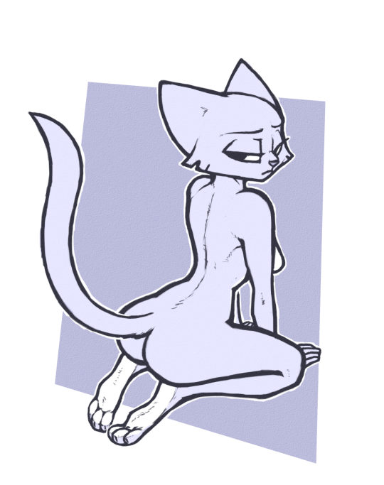
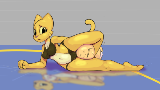
So I wanted to color something again and ran across this Katia by luraiokun as a gift to Rick2Tails.
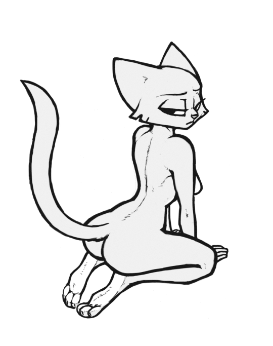
It caught my eye immediately. The white outline first, but notice the soles of the feet, the breast and the eye that aren’t colored in that light bluish grey really pop out. That’s the whole monochromatic thing again. But I just wanted a pretty cat butt to color, so afraid I didn’t go that route. Got rid of the square around it.
Another less obvious thing I did was remove all the saturation. There’s no color there, even if it appears to have blue in it. It doesn’t. It’s pure grey. That was done for a reason. Because when I apply my base colors on a Multiply layer, they will be darkened. But by first increasing the lightness, the resulting color will be just what it should be. I COULD have tried to remove the grey and make her white, but I’ve found that to be problematic. Better to leave it and brighten the base layer so the final color is what it should be.
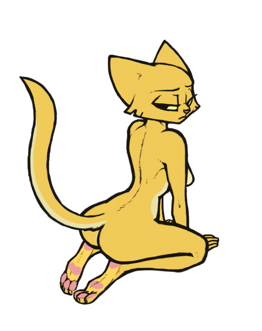
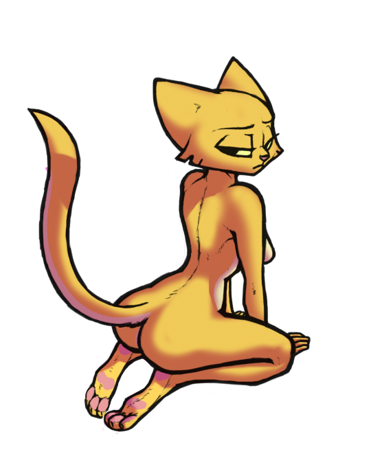
You might notice I put the pale belly (nearly white) color on the underside of her tail also and very subtly in her… um… well… butt. No, it’s not canon, but I felt like it for some reason. Probably primarily to add a bit more interest. Also originally I had colored her entire soles of her feet in pink, but revised that when someone said they looked like rat feet. He was right. Pads are better. Next up, shading.
I started with this soft shading, but when I got to this point, I realized that – though I think it looks okay, it doesn’t fit with the style of the drawing and all those hard edges. So I started over and went with hard shading instead.
Yeah. I think that’s better. Not as “3D’ as soft, but it fits with the style better. There’s 2 levels of shading here. The obvious, but right where she’s sitting on her heels, under her armpit and on her neck just below her head there’s a dark shadow. Next, I got creative. I wanted to represent fur as right now she’s too smooth.
So what I did was used a small eraser with a short fade and “bit into” the shadow to give the impression of fur without having to actually draw any. Just tried to keep those “bites” flowing roughly in the direction the fur would at each point. This took, a while, but I think it looks better as a reminder that Katia is SUPPOSED to have fur, not just yellow skin. And doing it in the shadow seems to work pretty well.
And that’s it. A bit of gloss and highlighting, a butt-shadow and a (frankly very quick) background that’s suggestive of an outdoor scene if only by the colors. And now I can take a step back, look at her…
And feel bad because she’s disappointed that I again colored her nude. Sorry sadcat! You just look so GOOD that way. Hey, at least there’s no visible plumbing!
Another that I played with by Zokva. Original Skull Crusher:
I went a lot of different ways with this. So first, here’s a “straight” version of what Zokva drew with colors:
I noticed then that she didn’t have a tail so I added that…
Then I thought… Maybe she would look good with her painted-on undies…
I really liked that. But then I did what I wanted to do all along. I didn’t originally see the guy caught in her leglock as a guy. I saw him as…
A bowling ball! And now that there is actually a bowling ball in Prequel, it makes more sense. You think crushing a pineapple between your legs is impressive? Katia can crush a friggin bowling ball.
That is probably my “real” version because I actually like how the paint turned out, but might as well combined the naked and the bowling ball I guess, right?
“That’s not weird is it?” Katia asks, concerned. “I mean, everybody can crush bowling balls between their legs, can’t they? I’m not weird, right?”
If you want to sex this cat, you’ll be risking your own life. Up to you if you think it’s worth it or not.
First, by ECMajor again. I’m just coloring. I got such a huge response from the last one though, how could I not? Of course, I know all the response was ECM’s And with halloween coming up, this was just a natural. HAPPY HALLOWEEN!
ECM calls it Nude Jersey Welcomes You.
I call it conflicted. I’m convinced it was ECMajor’s way of testing just how gross can an image be and still be sexy. Oddly enough, the answer is obviously, “Pretty Damn Gross!”. You’re gonna have to go even grosser apparently.
What is that? WHAT THE HELL IS THAT?
Well, I call it a Zombie-Dragon-Camel-Demon. Pretty common actually. 🙂
Now, I’ll tell you right now if you don’t zoom in on this thing, you’re missing a lot. And, of course, Tumblr doesn’t Iet you zoom in. If you know the 1280 filename trick, go for it. But I tend to ramble on, showing layers and stuff, but with all the new people watching, I won’t do that to you. Here’s my final colored version. You needn’t go any farther. Also I’ll put the full res version on FA shortly.
Okay, so here’s my layers. I’ll zoom in on the important bits so Tumblr’s shitty resolution won’t totally ruin it.
For base colors, I went with a rather tame fawnish color for the majority. Three levels of green for the scales. A sickly red for the topmost horns and that weird stuff going on at her back. Yellow eyes to pop out. I tried various colors for the wings, but the dark grey with a very slight blue looed best I thought. Mostly I am trying not to oversaturate colors. I tend to do that. Okay, on to shading.
ECMajor shades awfully well just in the drawing. There’s really little I have to do but follow his lead. And that determines the light source. I did bring the light source down somewhat from where most of his shade indicates though. Don’t know that it’s very noticeable. Highlighting is next, and that tends to be a problem for me. I definitely have a tendency to overdo it and make my characters look like they’re made of latex. (Um… I’m not saying that’s a bad thing. But my tastes aren’t necessarily everyone’s. Nor realistic. 🙂
Now for come closeups. Hey, you didn’t HAVE to read this far you know. Check out this beautiful face!
See why I suggest higher rez? There’s a lot going on there! Im particularly proud of the little muscles under the ripped off skin. Check this…
EWWW! That looks better (worse) than I ever expected!
Finally I settled on that rather plain background. I tried a variety of things, but really there’s so much going on her body, the background cries out to be simple. So I kept it that way in the end, just giving it a bit more than a simple gradient, and highlighting ECM’s sig that I’d almost obscured. Put my own in too this time. I used to think it was conceit to put a sig on for just coloring, but another artist pointed out that it’s preferred, so everyone knows if you screw it up badly, it’s not their fault. 🙂
Oh, and to leave you with another great part. Those outrageous hooves. Yikes.